Lena: SMU's all-pants combo feels like a nod to '70s nostalgia
Adamr: I don't get why the SMU combo needed matching throwback football cleats
Crimson Talon: Love seeing these designs but SMU's font choice feels a bit lazy
Milan: those uniforms look like they just grabbed all the leftover design ideas from the 90s
Iris: meh, just more merch pushing for a week 1 game
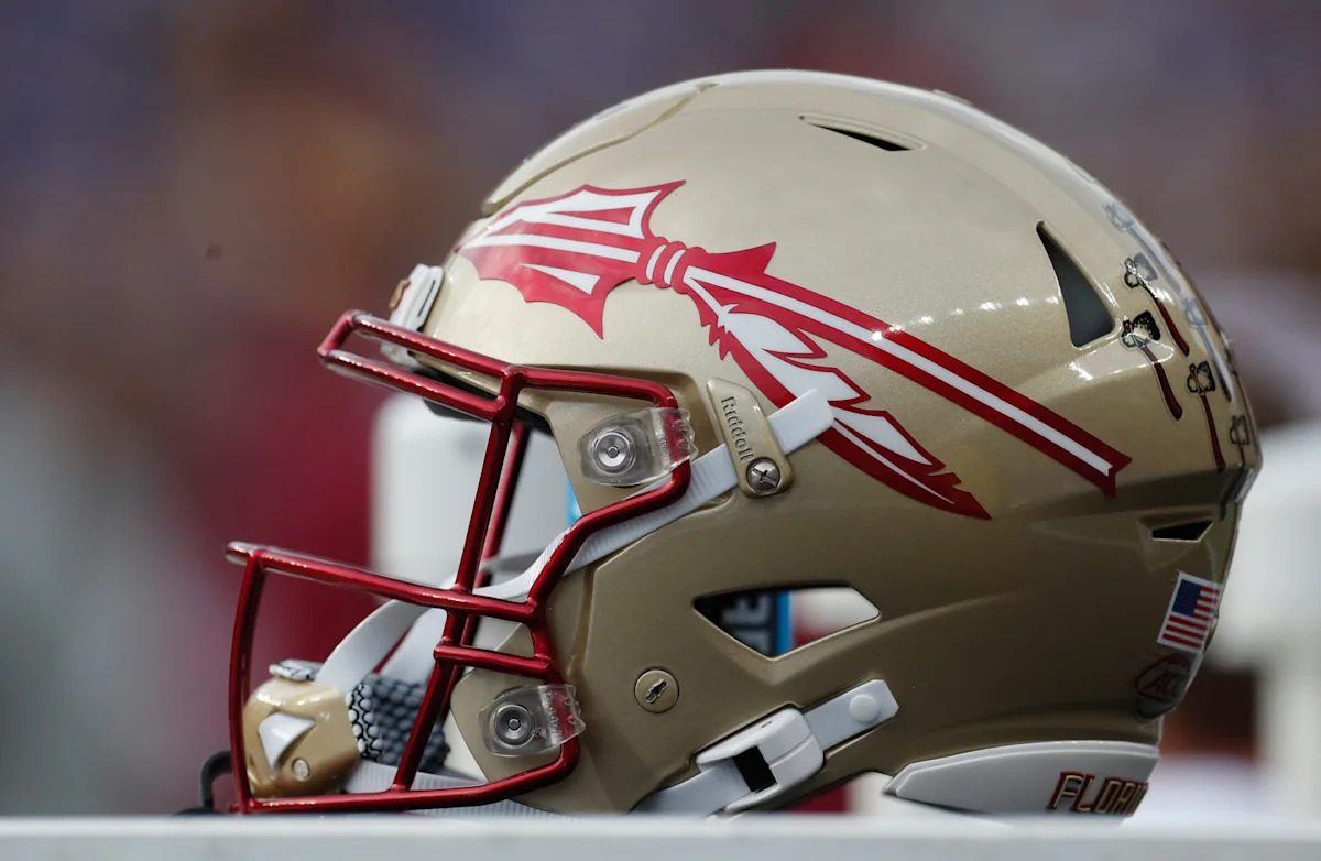
Velvet Oracle: tough looks for both teams, but gotta say Florida State's combo with the green helmet is my favorite so far
Umbra Sable: saw SMU's uni combo first and thought Florida State got robbed with those helmets
Dusk Cipher: the font on the numbers and trim is pretty sharp, but the main jersey feels a bit like they went for 'different' instead of 'good
Adamvoss: Finally some real effort into making sports uniforms interesting again this season can't wait to see if it makes a difference on the field somehow
Obsidian Specter: these combos are fine i guess but nothing to write home about
Lunar Halo: still can't decide who has the uglier uniforms though
Ariakwan: not mad at the SMU colors, but who greenlit those numbers on their helmets?
Ember Shard: uniforms are just a cheap distraction from the actual product on the field
June: FSU always gets the hype for their uniform reveals, SMU gets the underdog in style here though